
Building a Digital Experience
Summary
Destination Gettysburg needed a site that felt less like a brochure and more like an experience. Their old guide wasn’t capturing the community’s depth or inspiring extended stays. We built a new site designed as a true hub: bold storytelling, streamlined navigation, seasonal highlights, user-generated content, and resources for both travelers and locals. The result is a platform that works for history buffs and weekenders alike—an online home that finally matches the impact of the place.
Client
Destination Gettysburg
Scope
Campaign Title
Destination Gettysburg Website Redesign
Results
25%
increase in organic sessions
18.2%
goal conversion rate
3
pages viewed per session
5%
faster load times
Smart Navigation = Deeper Exploration
Destination Gettysburg wanted to redesign their website and highlight content that educates and inspires visitors to explore the natural beauty and history of Gettysburg. Additionally, the website would introduce visitors to things they didn’t know about the destination. We would use the new site to promote year-round visitation and provide community involvement resources to residents.

Seasonal Prompts That Work
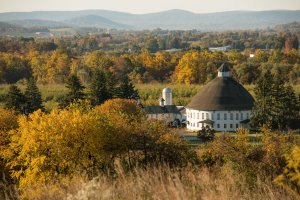
With timely updates and dynamic nav prompts, we turned every season into a reason to visit. From blooming battlefields in spring to orchard drives in fall, the site highlighted what’s worth seeing now.

A Site Locals Could Love Too
We didn’t forget the folks who live and work in Gettysburg. Community resources were added to make it easier for locals to connect with tourism efforts and promote their own businesses.


