
NORTHERN OUTER BANKS
Summary
The Northern Outer Banks had a fresh name and logo but no digital home that felt like them. Together we built a web experience that captured their easygoing energy, equal parts editorial and coastal. From simplified backend tools to interactive maps and story-driven content, every page was designed to make planning feel personal. The result? A website that gave this coastal community a clear identity, a stronger voice, and a platform ready for growth.
Client
Northern Outer Banks
Scope
Website
Campaign Title
Website + Brand Integration
Results
2.43M
impressions since launch
164%
increase in visitors
1:53
avg session duration (94.8% increase)
100
avg clicks per day on Business Listings
Craving More Than a Facelift
The Northern Outer Banks had a new name, a fresh logo, and a laid-back, salt-air vision. What they didn’t have was a digital presence that felt like them. The old site was clunky, hard to update, and scattered. Wildlife content lived off-site. The regional identity lacked clarity. And while the visuals were in place, the brand hadn’t found its emotional center. They didn’t need a facelift, they needed a full brand expression: clear, consistent, and intuitive. That’s where we came in.
Design with personality. Build with purpose.
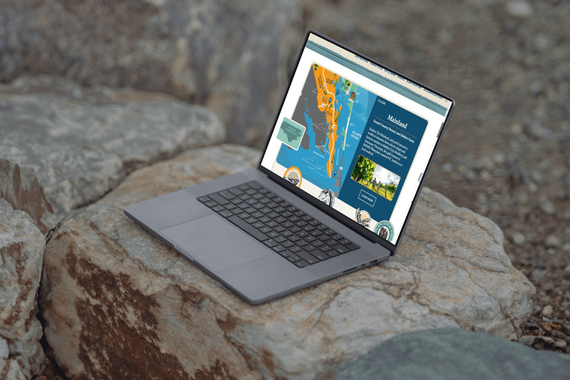
They were drawn to bold, editorial-style layouts and quirky touches so we ditched templated sameness and built something with visual personality: nostalgic textures, interactive maps, color sections tied to the regional differences across the destination (from the beaches to the mainland to the island), and a UX that says “laid-back but smart.” We implemented WordPress Full Site Editing with a simplified backend so the team could streamline regular content updatesWe also integrated a previously siloed wildlife education site directly into the main experience, giving it a permanent home and far more visibility.
A Site That Thinks Like a Traveler
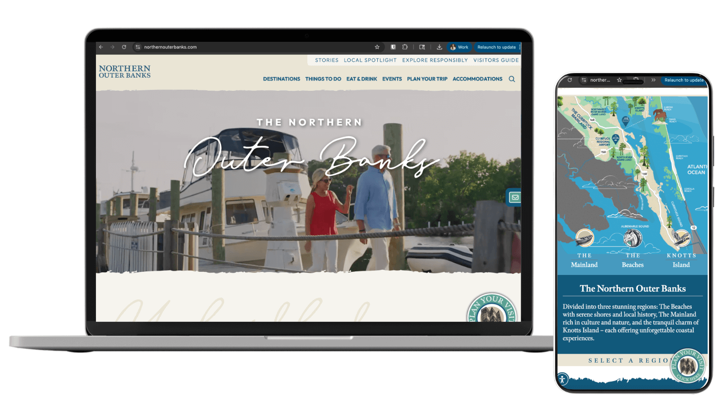
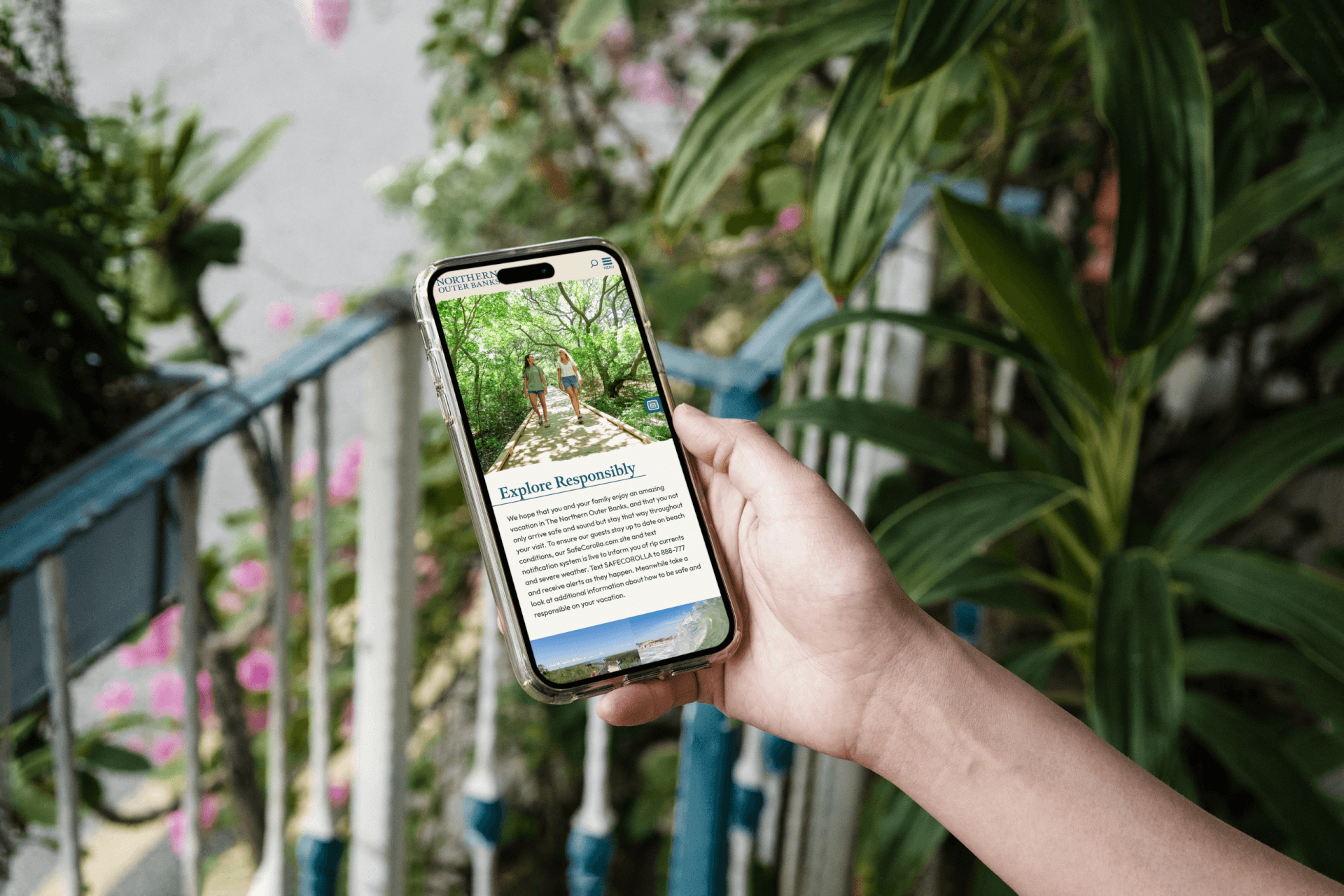
We knew users weren’t casually browsing, they were planning, with different goals in mind. Families, outdoor lovers, and culture seekers all needed distinct entry points. So we designed from the outside in. The site mirrors how people actually plan trips, with clear, intent-based navigation, curated itineraries for attractions (family fun, historic treasures) or seasonal itineraries for (Spring Escapes, Winter Wonders), interactive tools like the Visit widget and a Signature Events landing page, and a smart mix of evergreen and trending content to keep things fresh year-round.
Every Place Has a Personality. So We Built a Website That Did Too.
Each region of the Northern Outer Banks brings its own energy, history, and local flavor. The beaches offer resort-style amenities and long stretches of beach to soak up the sun, the mainland is a collection of 14 communities rich in rural charm and low-country beauty, and Knotts Island is where nature takes center stage and activities include slow and simple pleasures. And the residents made sure their corners of the community didn’t get flattened into one big beach town. We heard them and we built for them.
So what does personality-driven design actually look like? First, we developed a fully interactive map that lets you explore how each area fits into the broader Outer Banks story. We made sure each region was outfitted with custom iconography that reflects each place’s unique character and page structures that flex to spotlight the nuances of big oceanfront energy, cozy downtown strolls, and the quiet calm of tucked-away escapes.
Content That Sounds Local, Feels Global
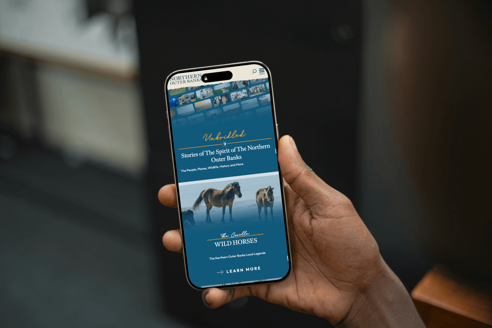
The old content was informational, not inspirational. Our new approach brought voice, warmth, and strategy. We paired SEO with editorial storytelling to reflect the area’s easygoing charm and to stand apart from its louder OBX neighbors. Stories focused on iconic sights like the Wild Horses and Currituck Lighthouse, local businesses and events, and gave off-the-mainland areas like Knott’s Island equal weight. This was a full system: voice and style guidelines, an editorial calendar, and a search-friendly structure built to keep the site discoverable, useful, and full of life well beyond launch.
Tactics That Worked Hard (and Looked Good Doing It)
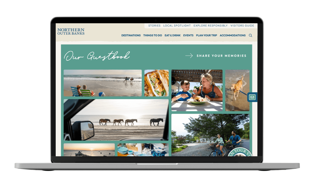
- Virtual guestbook powered by SHRPA: User-generated content that added credibility and community.
- Plan-your-stay widget from Visit Widget: Planning made frictionless.
- Accessibility integration via Userway: Inclusion wasn’t optional, it was built in.
- Embedded podcasting via Buzzsprout: Audio storytelling, meet smart UX.

