Read More
Situation
Visit Fairfield wanted to refresh their website and improve its performance. Visit Fairfield wanted its site to drive users to the destination and prove the organization’s in-market authority when visitors are making decisions about activities. Madden set out to build a website that educated and informed potential visitors while traveling planning about attractions, restaurants, wineries, and things.
Approach
The new site would incorporate a new brand personality into the content, showing the DMO as casual, conversational, friendly, and playful. We began by conducting a content audit to remove redundant and excessive copy and updated copy to match the new brand personality. Additionally, we reorganized on-page content to place the content users found most interesting, based on Google Analytics data, near the top of the page. We also created new content to fill SEO gaps and improve search ranking performance.
Following the content audit and new content development, we improved the user experience. We streamlined navigation by removing unnecessary dropdown menus and exhaustive options. We also added a hero video to greet users to the site and grab their attention. This project was reinforced by an improved site map which improved the site’s SEO rankings and drove more organic traffic.
To help Visit Fairfield achieve its business initiatives, we optimized placement of a hotel widget button to drive more bookings and added the widget to internal pages so it isn’t exclusive to the homepage. We also developed new content that focused on the accommodations at the destination. To help drive leads we made the newsletter sign-up and visitor guide download buttons more prominent and included a link to each at the top of all pages and the bottom of all articles.
Results
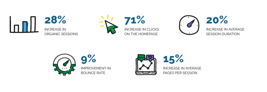
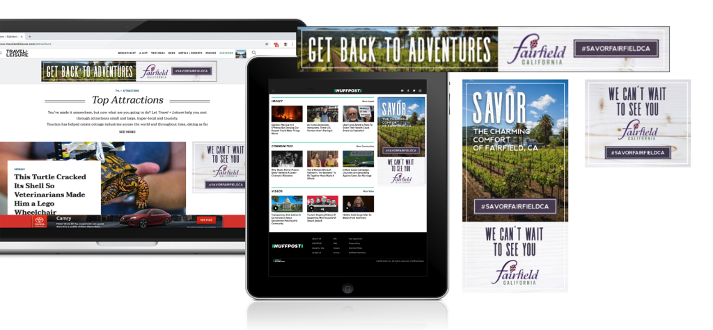
Flagship of new brand
The new site would incorporate a new brand personality into the content, showing the DMO as casual, conversational, friendly, and playful. We began by conducting a content audit to remove redundant and excessive copy and updated copy to match the new brand personality.
Enhanced UX
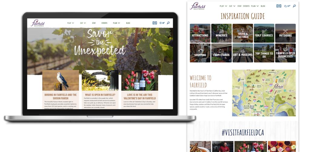
We streamlined navigation by removing unnecessary dropdown menus and exhaustive options. We also added a hero video to greet users to the site and grab their attention.
Goal Conversion
We optimized placement of a hotel widget button to drive more bookings and added the widget to internal pages so it isn’t exclusive to the homepage. We also developed new content that focused on the accommodations in the destination.
